It’s been a rough year for banks and the financial sector. Shortly after the new Current Expected Credit Losses accounting standard took effect the pandemic hit, resulting in an economic slowdown. Coupled with record-low interest rates and the need to shore up reserves for potential loan losses in accordance with the new standard, financials became the second-worst performing sector.
As the economy continues to slowly recuperate, communicating effectively to the investment community will be essential in retaining shareholders and attracting new investors (especially long-term investors who have been waiting to make their move). Considering a majority of people begin any search for information online, creating an impactful financial sector investor relations website will enable you to tell your investment story by providing investors with compelling and informative context that ultimately influences their decision to invest.
While providing financial data and reports is important, what separates the truly exemplary sites from the mediocre is a focus on providing context on the company’s strategy and clarity, as well as execution and vision. It’s also important to consider the design and user experience, as visitors are more likely to stay on a financial sector investor relations website that’s easy to navigate and visually engaging. Below are examples of how some of the top banking and finance sector companies are providing a great experience.
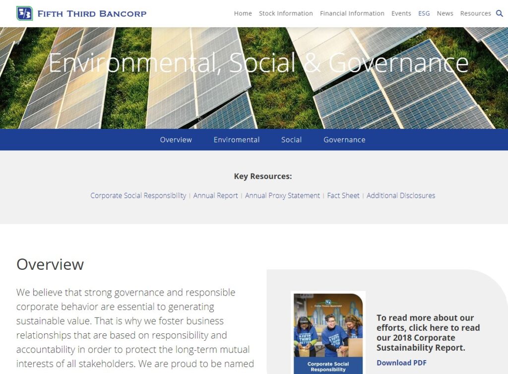
Fifth Third Bank: Dedicated ESG Section on Their Financial Sector Investor Relations Website
ESG continues to be an important factor in the investment decision-making process, so sharing information on your company’s policies is critical. Especially when it comes to the Social aspect of ESG, as companies who realized this was an essential component of their business’ resilience have been better able to successfully navigate the pandemic.
Fifth Third Bank has dedicated a portion of its financial sector investor relations website to its ESG efforts, where visitors can learn how the company is supporting its customers, community (including the environment), and employees. The company has also included documents and stats to demonstrate how it delivers on each of its ESG initiatives, which are all elements that investors consider when assessing your company’s future revenue potential. While there is a lot of information, it’s presented in a way that isn’t overwhelming and invites visitors to learn more about the company.
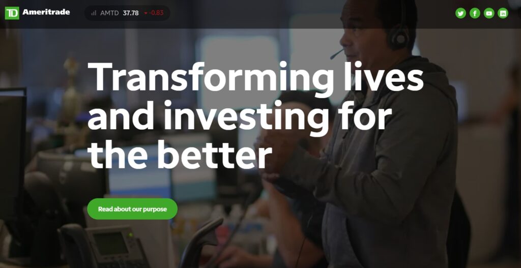
TD Ameritrade: A Mix of Visuals
Thoughtful design is a critical element of a good financial sector investor relations website. In fact, 75% of buy-side professionals say their interest in a company is diminished when the website is poorly designed. Incorporating different styles and content formats can help set your company apart and tell your story in a visually compelling way. Leveraging different design formats also helps to shine a spotlight on specific benefits or important details. It also brings some variety to the traditional investor deck format and can create a memorable experience.
On TD Ameritrade’s website, visitors are greeted with a fullscreen video set behind the company’s purpose statement. The bold, white text stands out against the video in the background, which has been slightly dimmed, to create a serious visual impact and instantly communicates the company vision. Throughout the financial sector investor relations website, TD Ameritrade uses a combination of video, icons, and photographs to humanize their brand, share important information (like financials, annual reports, SEC filings, etc.), and convey the opportunity they offer to investors.
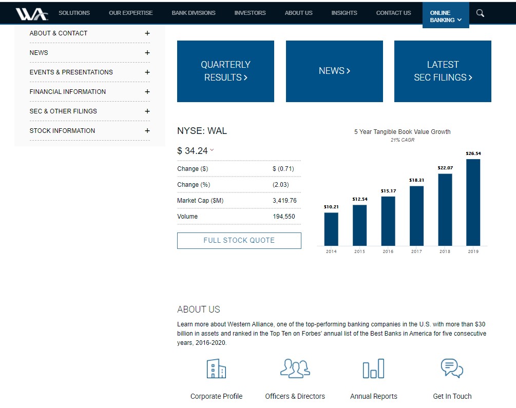
Western Alliance: Easy-to-Find Information
In addition to the overall design, making the financial sector investor relations website easy to navigate and find the right information creates a positive experience for visitors. Investor relations websites include a lot of content and information, which can be overwhelming. According to a study by Rivel Research, 42% of the buy-side says that “ease-of-use” is what makes a website “best-in-class.” Simplifying the navigation, grouping similar content, and prioritizing key information will make it easy for a visitor to find what they need in as few clicks as possible.
The homepage on Western Alliance’s financial sector investor relations website includes previews and links to relevant content, so visitors can quickly find the right information. The only copy on the page is the brief “About Us” paragraph, which includes links to the related pages just below. The website navigation is also clearly displayed on the lefthand side of the screen and can be expanded to view which pages are included under each header. Clicking through to the “Company Profile” page, visitors are drawn to the noteworthy highlights, which feature meaningful company achievements at a glance. In doing so, visitors who don’t have time to read the full description are still able to take away the key points.
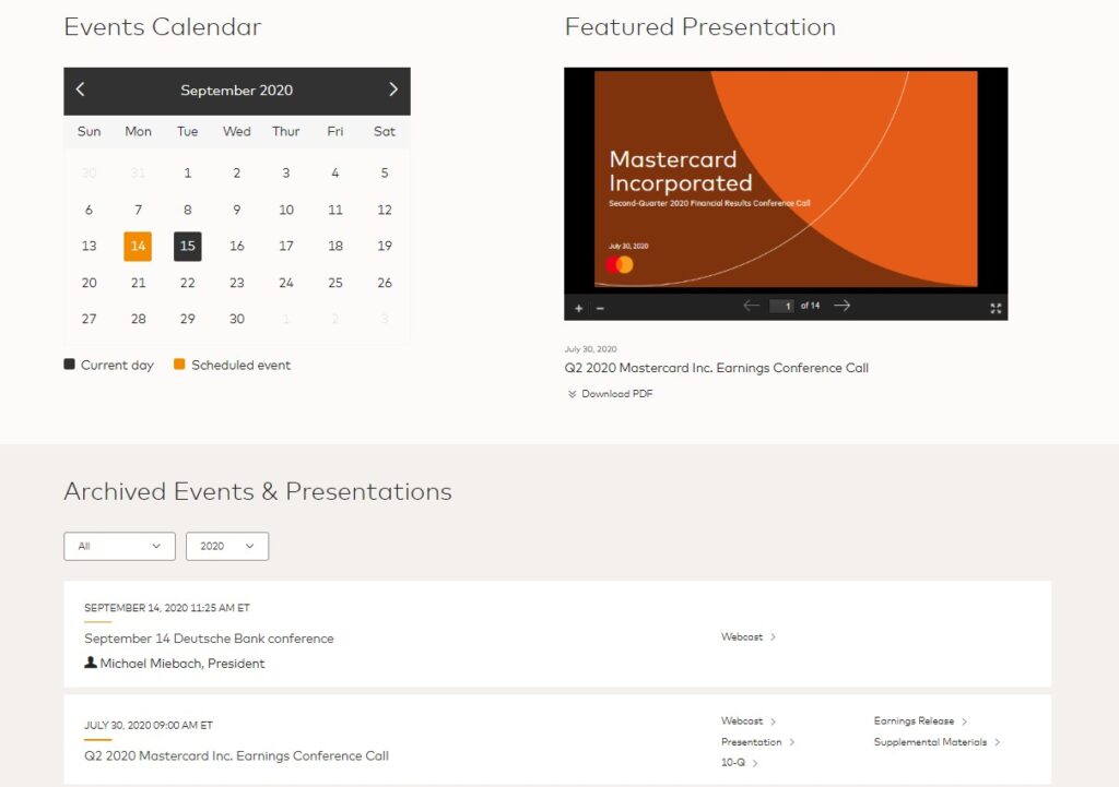
Mastercard: Quick Access to Events
After the pandemic hit earlier this year, travel and in-person meetings or events came to a halt. Even as restrictions around in-person gatherings begin to loosen, many are still choosing to meet virtually. While this shift to remote work caused some initial turbulence, many IROs are now seeing benefits from going online. Virtual events and webcasts enable quick and effective communication with shareholders while providing the opportunity to reach potential investors who may not have been previously accessible. Also, because attendees must register for virtual events and webcasts, the IRO is able to view who has watched the recording and correlate that data to the information in their CRM.
Mastercard provides easy access to past events. Links to the most recent recordings are featured on the top of the homepage and directs visitors to a form where they fill in basic details, such as name, company, and business email. The website also includes a dedicated “Events and Presentations” page where visitors can view or listen to past events, all the way back to 2006. Whether it’s an earnings call, leadership transition announcement, or forum, all recordings and their related materials can be found on a single page.
American Express: Include a Newsroom
When it comes to corporate communications, the sheer volume of information available has never been more complex to manage and disseminate. This is especially true for public companies that need to communicate with a variety of audiences, including journalists, bloggers, investors, consumers, and employees. Having a dedicated newsroom of carefully curated assets, such as press releases, media kits, awards, industry articles, and more can help tell your corporate story, build brand awareness, and ensure the right content gets into the right hands. For example, a recent study found that 25% of journalists visit newsrooms at least once a week for collateral.
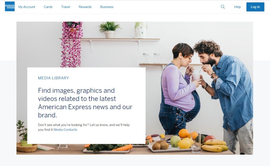
The American Express newsroom features the latest articles and press releases, followed by media contact information for both the global and regional arms of the business. When reporters are interested in a story, they often don’t have the time and resources to cover it. So producing stories in-house and publishing them on your newsroom, like American Express, provides reporters with easy access to information and business contacts, helping to increase the likelihood of getting picked up by a media outlet. The company’s newsroom also includes a media library with downloadable images and content, designed for reporters to quickly and easily grab assets at a glance.
Investor relations websites today are all about conveying a strong brand and engaging the user, whether they’re an analyst, shareholder, or potential investor. To learn more about how you can increase engagement and make a measurable impact with the investment community, download our Investor Relations Website Best Practices whitepaper.


